01
CSA Website
This project involved transforming a basic landing page into a fully structured website. The scope covered defining the site architecture, organizing content, and designing a clear, scalable interface that reflects the brand’s professional identity.
Client:
CSA Latam
Role:
UX/UI Designer
Team:
Stakeholder, Front-End Developer
Duration:
16 Weeks
Context
CSA LATAM only had a very basic landing page, more focused on having a minimal online presence than on clearly explaining who they are, what they do, and how they work.
The challenge was to transform that landing into a complete institutional website, starting from scratch.
The Problem
There was no real site structure.
The content didn’t clearly communicate the value proposition.
The brand had substance, but it wasn’t well represented digitally.
There was no clear path for first-time visitors.
My Role
Exploration and site architecture definition
Information hierarchy and navigation
Full UI design
Responsive design
I worked on the project end-to-end, from structuring the content to delivering the final design.
Process
Exploration
Analysis of the existing landing page
Understanding the business and its real offering
Identifying what content was essential and what wasn’t
Architecture
Definition of main sections
Content organization based on user intent
Creation of a clear, scalable sitemap
Architecture became the core of the project: organizing the message so the site could explain itself.
Design
Website design from scratch
Reusable components
Consistent visual system
The visual design supports the structure: clean, clear, and content-driven.
Outcome
CSA evolved from a basic landing page to a complete institutional website
Clear and intuitive navigation
Stronger and more focused main message
A solid base for future growth (new sections, services, content)
Digital presence aligned with the brand’s professional level
The result is a website that doesn’t try to oversell — it simply explains better.

All hero visuals and illustrative content images in this project were generated with Midjourney. From abstract concepts to human-focused scenes, we crafted and refined each one to support the visual narrative and reinforce the project’s storytelling.
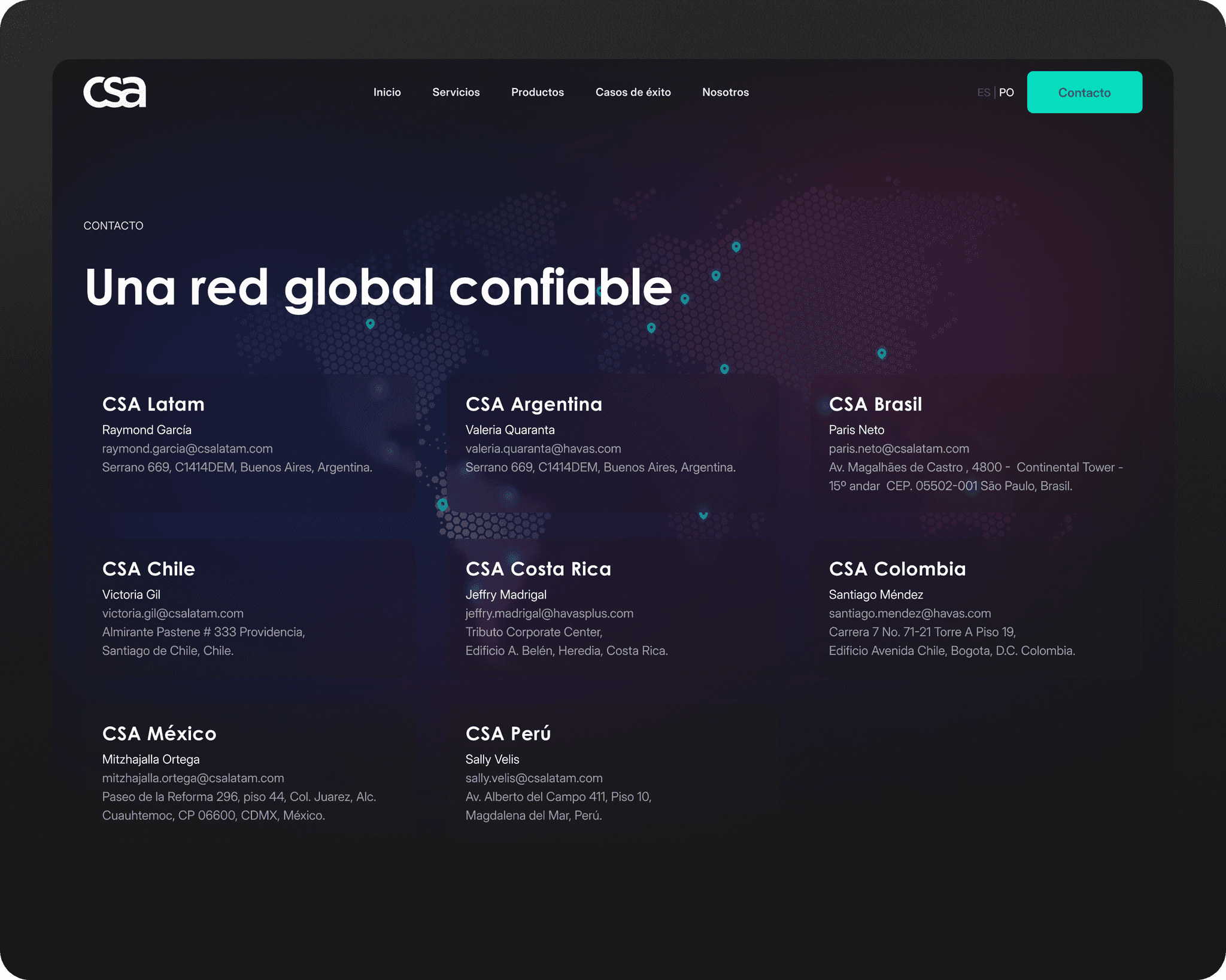
Simple, useful contact: country cards, editorial map and an obvious CTA to get in touch. Designed so visitors find the local contact in two seconds and start the conversation without friction.

Flagship projects, no fluff: big mood hero, highlighted case in the list, and quick access to outcomes and screens. Designed so viewers can scan and dive into the story that interests them.

Strategic consulting that links data strategy to business outcomes. This page presents the service, expected results and the assets that prove our approach.
Conclusion / What I Learned
This project strengthened my approach to information architecture while also pushing me to level up my UI skills.
Designing the interface after defining a solid structure allowed me to focus on visual clarity, consistency, and detail — not just aesthetics.